
When packaging becomes storytelling: how a pack tells the story of a coffee beyond the product
Senza categoria -
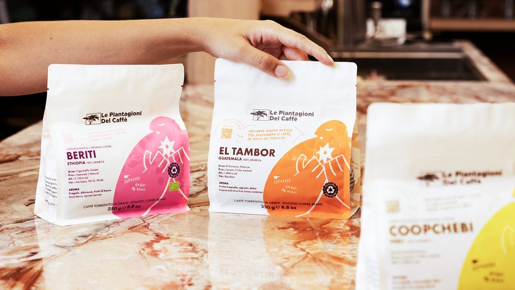
Earlier this year we unveiled our new packaging, the result of a rebranding project created to refresh the way we talk about coffee and to bring every pack more closely in line with our identity.
Last May we spoke with MTPak Coffee, one of the leading international publications on coffee packaging, about this journey and about the role we believe packaging can play in our industry today.
The interview gave us the chance to explore an idea we consider central: packaging is not just a container for a product, but a way of telling its story and expressing the vision of the company behind it.
In the article Should you print custom coffee bags with logo?, Bhavi Patel gathered the views of our Head of Sustainable Development and R&D, Prunella Meschini, and our CEO, Iacopo Bargoni, starting from a key premise: the pack is often the first point of contact between consumer and product, shaping how a brand is perceived even before the coffee is tasted.
This is precisely why it cannot be treated as a purely aesthetic element, or simply as a space for the logo.
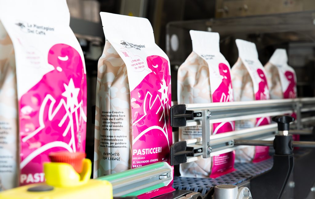
A logo identifies, packaging tells a story
A logo makes a brand recognisable, builds familiarity and strengthens its identity over time. It is an essential element, but on its own it cannot give voice to everything that lies beyond the logo itself: packaging is where we can share the information and content that help people understand the product better.
As we explained to MTPak Coffee, a pack must above all be a language, one that tells the story of the product and guides whoever chooses it, whether consumer or professional, in getting to know it and using it.
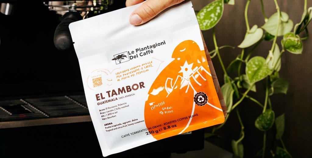
A coffee is more than a name or an origin: behind every pack there is a story, a botanical variety, a processing method, a sensory profile and the work of the people and places involved in the journey that brings it to the consumer.
The role of packaging is to make this complexity visible, turning information and content into a useful aid for anyone who wants to understand better what they are choosing. In the world of specialty coffee, every product carries a great deal of information: the challenge is to find a way of expressing it without simplifying it, creating common ground between those who work in the industry and those encountering this world for the first time.
From product to brand identity
If packaging can help people understand a product and its value, its role does not stop at communicating the characteristics of the coffee. A pack can also convey the vision of the company that makes the product, its values and the way it approaches its work.
We also explored this distinction in the interview: packaging can simply show a logo, or it can become a way of building a brand identity.
We believe that a brand, to be a real brand, needs more than a recognisable logo: it needs a set of communication tools that convey its values and allow people to identify with those values, and to choose it for that reason.
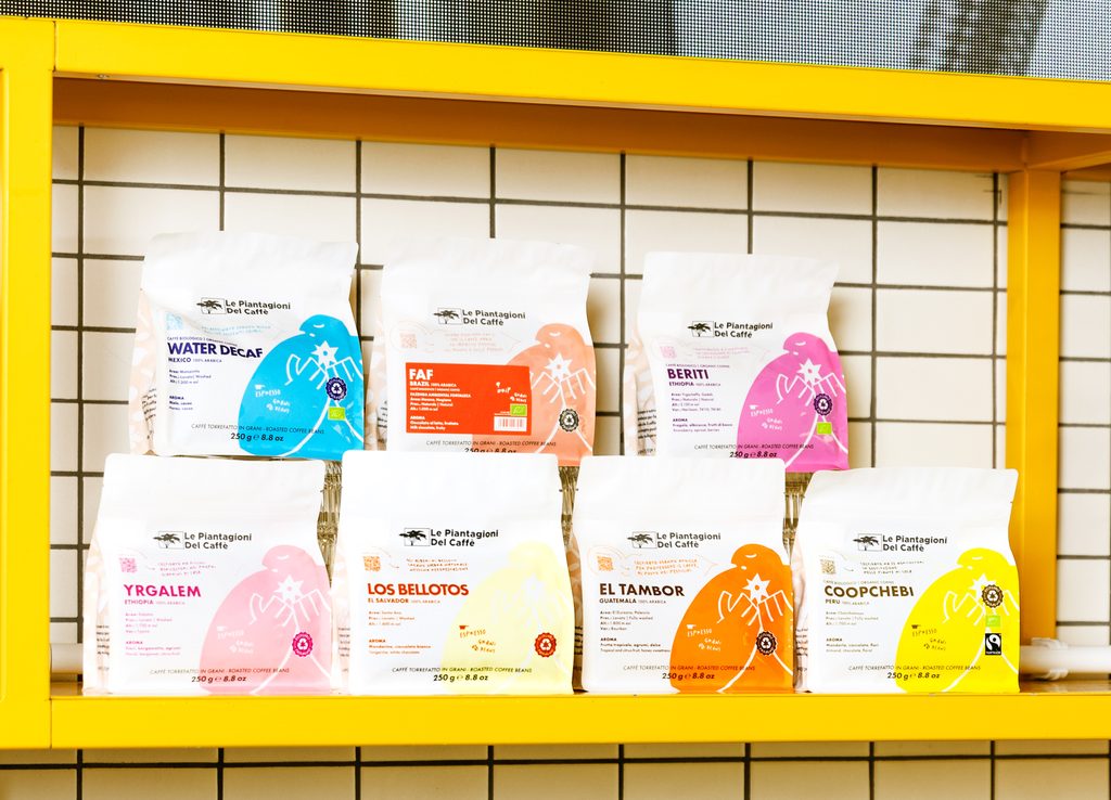
This is the principle that guided our rebranding: designing packaging that goes beyond the logo and gradually communicates the way we see coffee through a dynamic, modern and minimal visual language.
A pack, then, does not only describe the characteristics of the product, but also expresses the identity of the company behind it, helping to build a relationship with people that is recognisable and consistent over time.
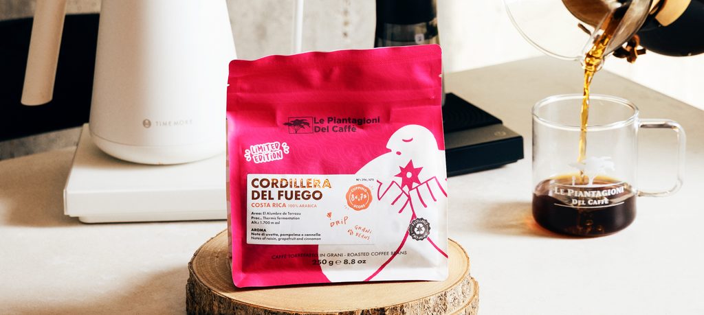
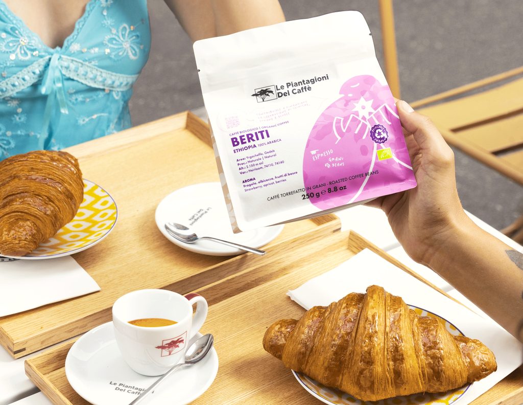
Visually appealing, easy to read
Designing packaging that communicates well means finding a balance between aesthetics, information and functionality.
Design does more than make a pack recognisable: through deliberate visual choices, it can shape how the product is perceived and build a coherent reading experience. Colours, visual hierarchy, images and content work together as a system that guides the eye and gets the message across more quickly.
This attention to the way information is presented is also backed up by research into purchasing behaviour. Some studies show that elements related to sensory characteristics and origin are among those that draw the most visual attention on labels, and that packs that highlight them graphically show higher purchase intent.
In other words, what a roaster chooses to highlight on the pack contributes to the perception consumers build of the product.
When values take visible form
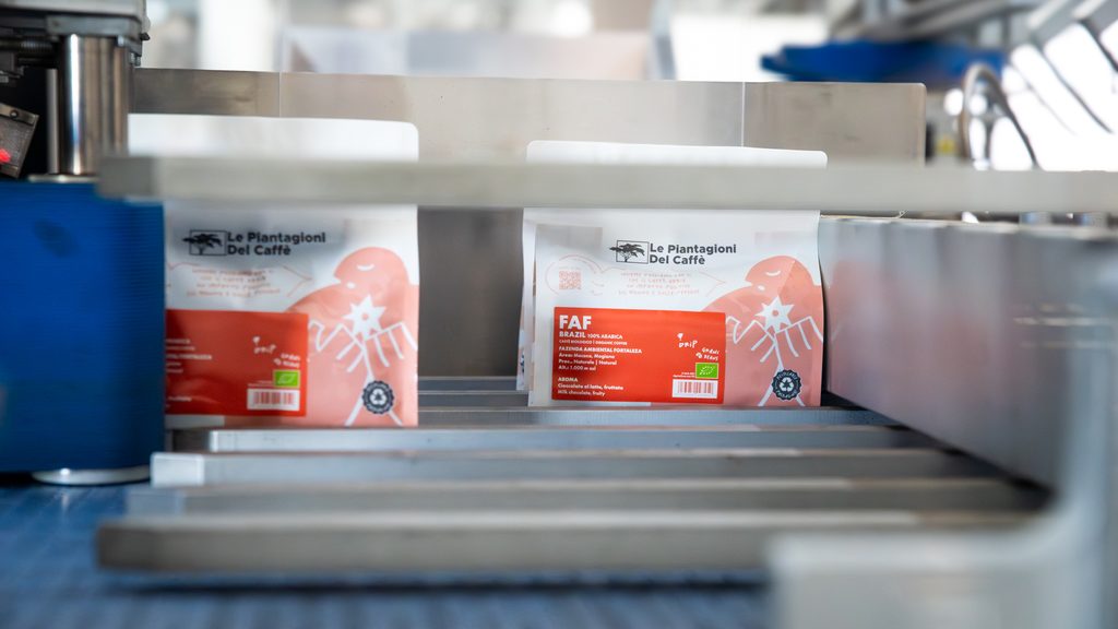
One of the challenges of the new packaging was to turn certain aspects of the way we work into elements that can be recognised at a glance.
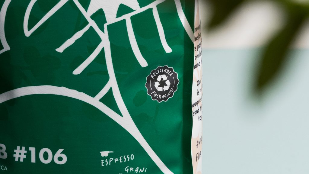
That is why we chose to feature specific content on the pack, such as the icon showing the characteristics of the packaging material and the callout dedicated to the product’s ESG aspects. Both were developed in-house and make our approach to quality, transparency and responsibility clearer and easier to grasp.
The technical choices behind the material are part of this journey too: the new packaging is aluminium-free and made from 100% recyclable mono-material plastic, with 30% post-consumer recycled (PCR) content. The pack is also Carbon Neutral certified and has a zip closure designed to keep the coffee at its best after opening, a practical detail for everyday use.
Every element on the pack is therefore the result of a deliberate choice: to make the link between the product, its characteristics and the work behind it clearer.
From Specialty People to Elpy: visual language that supports the message
The evolution of our visual identity is part of this journey as well.
For many years, the “Specialty People” illustrations told the story of coffee through people, putting at the centre the stories and relationships that define our industry. Over time, we felt the need for a more versatile and contemporary language, one that could adapt to different communication contexts while keeping people at its heart, alongside the quality and origin of the coffees.
This need also came up in our conversation with MTPak Coffee:
We felt we needed a more neutral tool that would communicate our values better. At the same time, we did not want to lose the reference to people, who, along with the quality and sustainability of the product, remain the most important part of how we understand coffee. That is how the idea of Elpy was born.
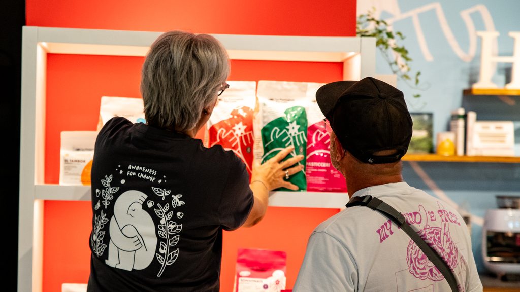
More than a mascot, Elpy is an element of the visual system that accompanies the brand’s storytelling and makes the principles behind Awareness for Change easier to understand: promoting a more conscious coffee culture, in which quality, origin and responsibility are part of the same experience.
In our project, every choice stems from this balance between form and content: creating coherent communication in which every graphic element helps to clarify the value of the product and the way we want to tell its story.
Choices that point to the future
Il confronto con MTPak Coffee ci ha permesso di approfondire una riflessione che riguarda il ruolo che il packaging può avere oggi e in futuro nel mondo del caffè specialty.
Investire nel packaging significa fare una scelta che va oltre l’aspetto estetico: significa progettare un elemento capace di proteggere il prodotto, ridurre il proprio impatto ambientale attraverso soluzioni più responsabili e allo stesso tempo comunicare in modo coerente il valore del caffè che contiene. Ogni decisione, dai materiali utilizzati alle informazioni condivise, contribuisce a definire il rapporto tra azienda, prodotto e persone.
È questa la direzione che vogliamo continuare a seguire: sviluppare un modo di raccontare il caffè in cui innovazione, qualità e responsabilità procedano insieme, perché il valore di un prodotto non nasce soltanto dal risultato finale, ma da tutto il percorso che lo rende possibile.